Bogdan's Head

One August Slot Available — I Take Only 3 Projects Per Month to Ensure Quality

Logo of a Bloc

eix

eix

Branding

A brand identity for a neighborhood bakery that wanted to feel less like a shop and more like a family you happened to wander into. Eix needed an identity that could carry the warmth of "we loaf you like family" without tipping into the soft, forgettable sameness most bakery brands fall into.

A brand identity for a neighborhood bakery that wanted to feel less like a shop and more like a family you happened to wander into. Eix needed an identity that could carry the warmth of "we loaf you like family" without tipping into the soft, forgettable sameness most bakery brands fall into.

the concept

the concept

The starting point was the dough itself. When bread is scored and given real time to rise, it opens up, bakers call the little air pockets that form "eyes." The face was already there, hidden in every well-made loaf. I just stopped scraping it off.

That became the whole system. Not a mascot bolted onto packaging, but a face that's really just a magnified look at what good bread does naturally when it's given time and attention.

The starting point was the dough itself. When bread is scored and given real time to rise, it opens up, bakers call the little air pockets that form "eyes." The face was already there, hidden in every well-made loaf. I just stopped scraping it off.


That became the whole system. Not a mascot bolted onto packaging, but a face that's really just a magnified look at what good bread does naturally when it's given time and attention.

The starting point was the dough itself. When bread is scored and given real time to rise, it opens up, bakers call the little air pockets that form "eyes." The face was already there, hidden in every well-made loaf. I just stopped scraping it off.

That became the whole system. Not a mascot bolted onto packaging, but a face that's really just a magnified look at what good bread does naturally when it's given time and attention.

Logo of a Bloc

a face that means something

a face that means something

The name itself carries the same idea. Eix is Catalan for axis the fixed center everything else turns around. Every family has one: the table, the one who's always up first, the one everyone circles back to.

The face sits at that same center across every touchpoint, apron, packaging, wall, the one constant thing you see everywhere, the way a family has one steady point holding the rest together.

Logomark of a block on yellow bg
Logomark of a block on red bg
Logomark of a block on green bg

evolving the visual style

evolving the visual style

Running underneath the identity, a repeating face pattern shows up on wrapping paper, cups, and backgrounds, quiet, textural, never louder than the product itself.

Bloc Image Visual with text
Bloc Image Visual

scalability that matters

scalability that matters

The system had to work as hard as a real bakery's marketing does: daily product posts, seasonal promos, event flyers, team hiring content, in-store signage. A flexible type-driven headline system (WE LOAF YOU) paired with the face and pattern gives the team a repeatable structure for every new post, without reinventing the format each time.

Blog Identity with Photography
Bloc app icon
Bloc app icon
Bloc Pattern
Blog Identity with Photography
Bloc app icon

next project

next project

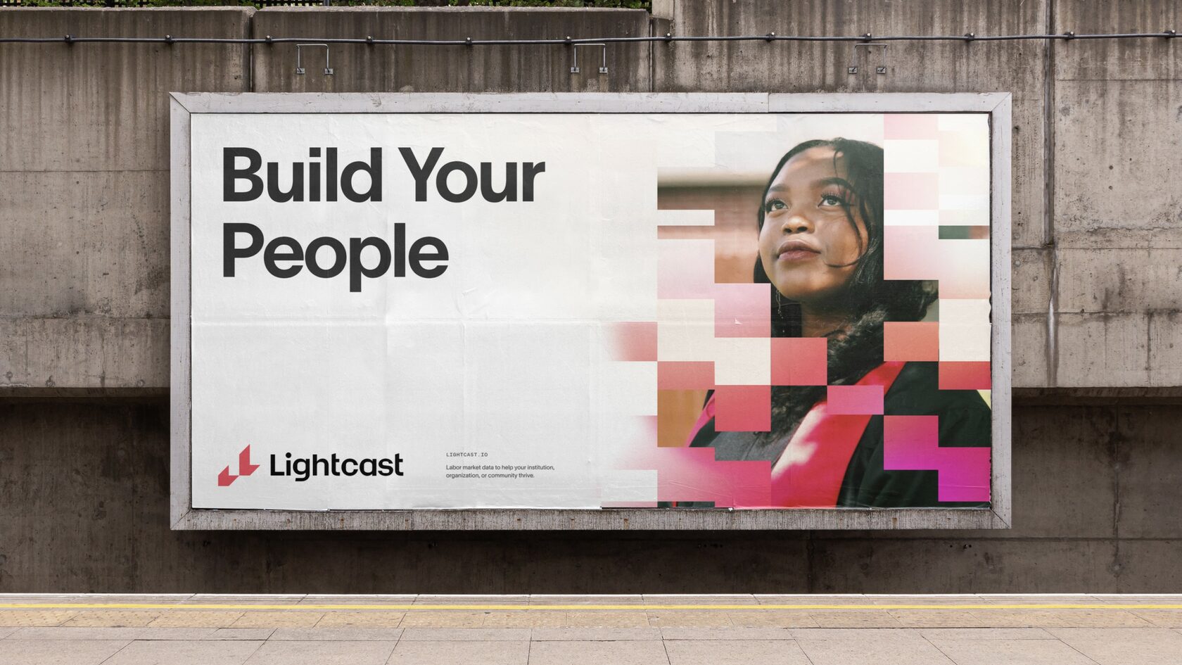
Image of a Lightcast brand on billboard

lightcast

Branding

Strengthened brand credibility and perceived value, supporting higher-ticket sales and enterprise positioning.

Bogdan's Head

One August Slot Available